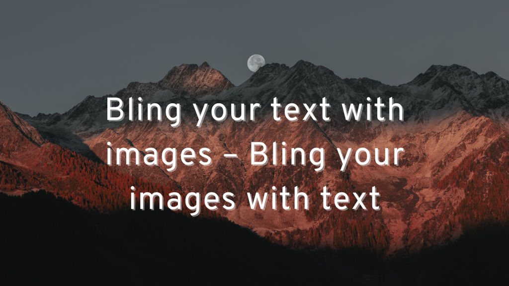
Something exciting has been happening with online business communications over the past few
years. There is a growing convergence of text and images.
Help me out if my math is weak. If a picture is worth a thousand words, then a picture with three
words on it is worth 3000 words. Did I get that right?
Why bling your text with images?
The fact is that a blog post that is all text is boring. Social media posts that are all text get scrolled
over. Add an image, and they sparkle. People pay attention. In fact, the latest data shows that an
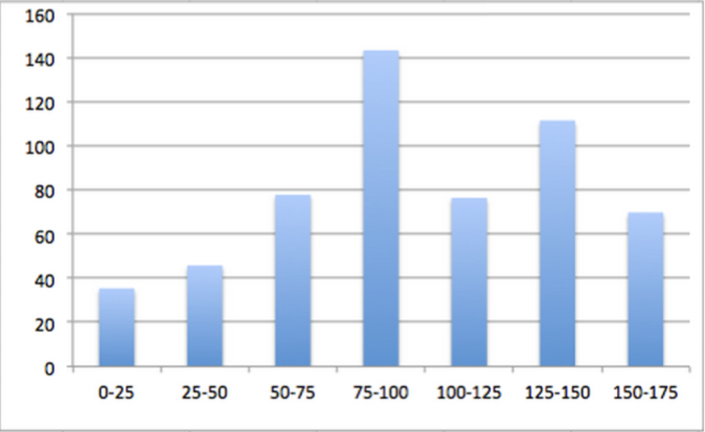
image every 75-100 words maximizes shares of the blog post. We didn’t quite make that ratio here,
but we are close.
So, including images in your blog posts and articles is critical to grabbing readers’ attention.
It’s no different on social media. Jeff Bullas reports a 94% increase in views when an image is
added.
So, if you want people to share your blog post on social media, so that more people can read it.,
images are vital.
Why bling your images with text?
But have you noticed which social media posts get shared the most? Right, the ones where there is
text on the images. People might scroll right past an all-text post. They might stop to view a post with
an image. But they will actually stop to read the text on an image.
That’s why memes are so popular.
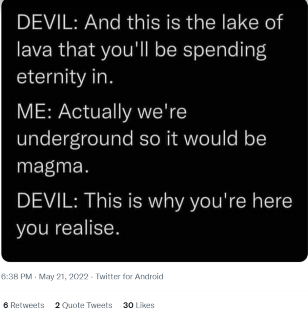
Even an image that is only text gets shares and likes. If this image had been just text typed into
Twitter, it likely would have been ignored. But make it an image, and it looks like I was not the only
person to retweet it.
So, your strategy should be to add images every 100 words or so, and add text to at least one
image, ideally your featured image that gets picked up automatically by Twitter and Facebook and
LinkedIn.
Here are four types of text images you might consider using.
Title images
These are so simple to create. All you have to do is repeat the title of the post in an image format.
Think of this as an alternate delivery of your article’s title.
If you have worked hard to craft the right title to attract attention, re-creating that title in a visual
format will help it get even more attention.
A great example of a title image can be seen in this blog post, right here on this blog.
Topic images
Topic images are just as easy to create as title images. In fact, they are very similar. A topic image
would typically deliver the same message as the title, just in different words. Or it might pull one key fact from the article.
Why would you want to use different words in the image than in the title? You can grab people’s
attention in two different ways, using two different sets of words that might appeal to different people.
This can be especially useful if you write creative titles. The text in the image helps make sure that
people get the context of your creativity.
Or you can add more information when the title and the image are combined. Keep in mind that the title might automatically populate on social media. You might not want to have the same words in the image as just below the image. You might want to be able to say more with the image and title
combined.
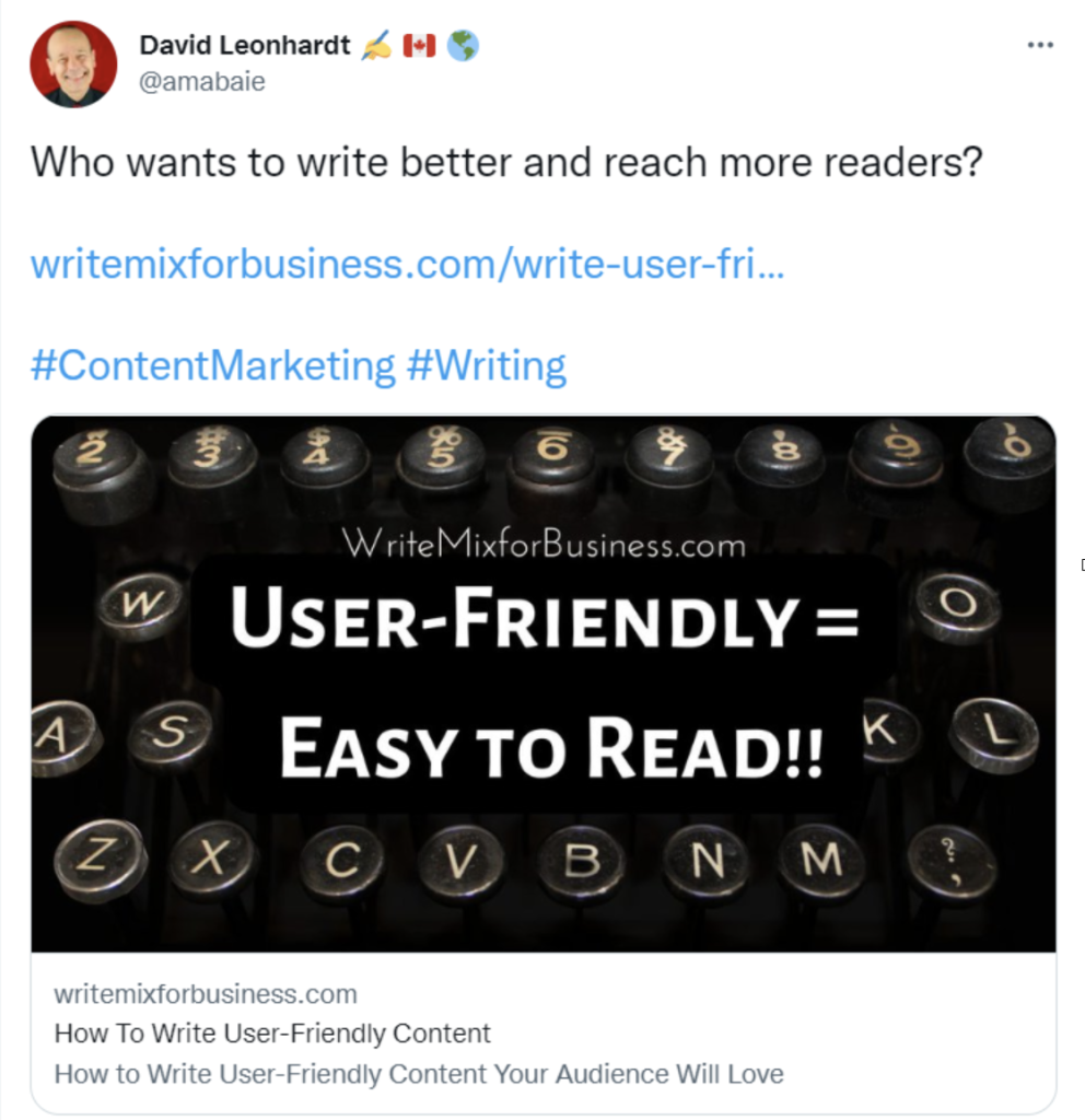
Sue-Ann Bubacz does a great job of this on posts like this one. See how the message in the image
supports the actual title of the blog post? It explains the title in a way that puts the readers in the
right frame of mind to absorb the content.
And see how well that works on Twitter?
Mini infographics
In my opinion, these are the most underrated and most underused form of images. A mini
infographic gives a good shot of information in a small space. It gives readers something substantial to share in a single image.
A traditional infographic tries to cram as many stats as possible into one long graphic. A min
infographic delivers just one stat or one set of data in an easy-to-digest size.
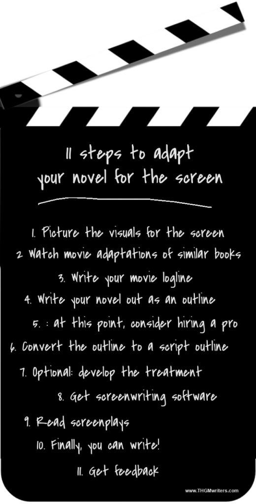
You won’t be surprised to learn that I use these a lot. Often, I use them to provide a list. People can
then visit my blog to read the full content. A superb example of this is my post on how to adapt your book for film.
Notice that further up in the post, I also have a topic image, which is essentially the header of the mini infographic. That is an approach I use quite often. It helps with social media to have both shapes, since Twitter and LinkedIn prefer horizontal images, whereas Pinterest and some others prefer vertical images.
Quote boxes
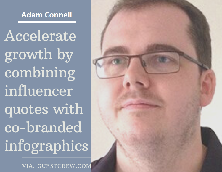
One of the more popular types of text on images is quote boxes. This is where you pair up a head shot of somebody along with something they said. The quote could come from almost any source:
- Yourself
- A famous person
- An influencer whose attention you want to attract
- A book or report you read
- A well-known saying
- The blog post itself
Each of these has its benefit.
One of the more amazing examples of this is Uttoran Sen’s expert roundup on growth hacking. He curated input from 60 online marketers. Then, he created a quote box for each of them. Here is an example of Adam Connell – a great example for this article because of what he says.
Uttoran told me he spent several hours creating the quote boxes. And I believe him!
I asked him if it was worth it. “Yes, the benefits surely outweigh the time invested. I would say it generated about 73% more shares than normal text.” This is a great technique to ride the growing wave of influencer marketing.
Text and images – the perfect pair
Some things just go together naturally. Batman and Robin. Pie and ice cream. Text and images.
Without the images, blogs and social media posts don’t get noticed. Without text on the images, they won’t get read. With text on images, your blog gets read and shared on social media. I hope the examples above inspire you to bling your blog with text on images.
David Leonhardt runs THGM Writing Services. When he is not writing on every available surface, including images, he and his team help individuals and small businesses find the right words to deliver their messages and market themselves. Follow him on Twitter and LinkedIn.

It is very useful to support it with pictures, especially when writing blog posts. I think it provides focus. It is also pleasing to the eye. Thanks a lot for your great ideas, I will implement it.
Blinging your images with text is a versatile tool that can serve various purposes such as, enhancing communication, reinforcing branding and encouraging user engagement. The key is to use text thoughtfully and in a way that complements the overall message and aesthetics of your visuals.